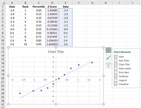
Qq Plot In Excel

Creating a QQ plot, also known as a Quantile-Quantile plot, in Excel is a bit more involved than generating some other types of plots, as Excel does not have a built-in QQ plot feature. However, you can create a QQ plot using Excel by following these steps. This guide will walk you through the process of creating a QQ plot to compare the distribution of a dataset against a normal distribution, which is one of the most common applications of QQ plots.
Step 1: Prepare Your Data
First, ensure your data is in a single column. For this example, let’s assume your data is in column A, starting from A1.
Step 2: Rank Your Data
To create a QQ plot, you’ll need to rank your data and calculate the quantiles. In a new column (let’s say column B), you can rank your data using the RANK function. However, since we’re aiming for quantiles, we’ll directly calculate the quantile positions.
Step 3: Calculate Quantile Positions
In column B (starting from B1), you can use the formula to calculate the quantile positions for your data. The formula for the i-th quantile position is given by (i - 0.5) / n, where i is the row number (starting from 1 for your first data point) and n is the total number of data points.
=(ROW(A1) - 0.5) / COUNT(A:A)
Drag this formula down for all your data points.
Step 4: Calculate Theoretical Quantiles
Next, in column C, you’ll calculate the theoretical quantiles from the standard normal distribution (mean = 0, standard deviation = 1) using the NORM.S.INV function, which is the inverse of the standard normal distribution.
=NORM.S.INV(B1)
Drag this formula down for all your data points.
Step 5: Plotting the QQ Plot
- Select the data in columns A and C.
- Go to
Insert>Scatter(with only markers, no lines). - You will get a scatter plot where the x-axis represents the theoretical quantiles from the standard normal distribution and the y-axis represents your actual data.
Step 6: Interpreting the QQ Plot
- If the points in your QQ plot closely follow a straight line, it suggests that your data distribution is similar to the normal distribution.
- Deviations from the straight line, especially in the tails (the left and right extremes of the data), indicate deviations from normality.
Additional Tips
- For a more precise interpretation, you might want to add a line to your plot that represents perfect normality (the 45-degree line where x = y). You can do this by plotting a series of data points where x = y over the range of your data and adding this series to your scatter plot.
- Remember, Excel’s limitations mean you might find it more straightforward to work with statistical software like R or Python for more complex statistical analyses and visualizations.
By following these steps, you can create a basic QQ plot in Excel to visually assess how closely your dataset follows a normal distribution, which is crucial for many statistical analyses.

